Publication-Quality Plots in Python with Matplotlib

Table of Contents
Introduction
The synthesis and analysis of data and results in graphical form is a topic of interest for professionals from the most diverse areas, whether in the production of technical/scientific, educational content, or for digital media outreach. A good figure will attract the attention of your target audience.
There are four topics that, in my opinion, directly influence the final result of the plots that will be produced, especially when we talk about publication quality. They are:
- Localization: Numerical formatting should be in accordance with the language for which you’re producing content, whether in formatting dates, currency, or even the decimal separator;
- Style: Here various visual aspects are defined, such as the plot’s color scheme, axes and background, font, and other elements. It’s important to maintain consistency across the various plots that will constitute the same document;
- Dimensions: The definition of the figure’s width and height, as well as font size, should be consistent with the type of content where the plot will be inserted, whether in slides, poster, report, article, social media posts and many others;
- Format: The format in which figures will be saved. Vector options are preferable because they maintain good visual presentation even on high-resolution screens or prints, or when figures are enlarged.
Methodology
The points above will be addressed in Python, or more specifically, in the Matplotlib package, which is a 2D plotting library that produces publication-quality figures in a variety of print formats and interactive environments across multiple platforms. Matplotlib can be used in Python scripts, Python and IPython shells, Jupyter Notebook, web application servers, and four graphical user interface toolkits. Matplotlib tries to make easy things easy and hard things possible. You can generate plots, histograms, power spectra, bar charts, error plots, scatter plots, etc., with just a few lines of code.
Additionally, Matplotlib plotting functions are integrated with major data management solutions in Python, such as NumPy, Pandas, Xarray, Dask and many others.
Refer to the Matplotlib documentation for the best way to install it on your system. We can import it into our code with:
import matplotlib.pyplot as plt
Now let’s specifically address each topic listed for producing publication-quality figures.
Localization
If your interest is to produce content in English, I suggest you skip to the next topic. Otherwise, we can use the locale package to ensure consistency of our figures with the standards of Portuguese, for example, or really any other language. To do so, we can import the package and set the default language as Portuguese:
import locale
locale.setlocale(locale.LC_ALL, "pt_BR.utf8")
All customizable parameters are stored in the dictionary plt.rcParams, a complete view is available on its Documentation page, but don’t worry, the main points will be demonstrated here.
The next step is to inform that we want to use another language for notation on the plot axes, for example, using , as decimal separator, we do this with the following code:
plt.rcParams.update(
    {
        'axes.formatter.use_locale' : True,
    }
)
It doesn’t make sense to confuse the audience with different decimal separators if we can easily solve this with three lines of code, right?
Notice that this definition is only valid for figure axes, not modifying the behavior of Python’s core itself, for example:
value = 0.67
print(value)
0.67
Note that the print still uses the dot as decimal separator. For prints, annotations or legends in figures, we can use the locale.str() method to automatically format floating-point numbers:
print(locale.str(value))
0,67
This can be a good practice, since you just need to return one line of code to English (locale.setlocale(locale.LC_ALL, "en_US.utf8")), and all the rest of the code will behave appropriately.
It’s also possible to easily format monetary data:
print(locale.currency(value))
'R$ 0,67'
And date formatting, with the time package, see:
from time import gmtime, strftime
strftime("%a, %d %b %Y %H:%M:%S +0000", gmtime())
'Wed, 14 Oct 2020 22:31:50 +0000'
Style
Now let’s talk about figure style, including color sequence, axis style, background color, presence or absence of grid, as well as its own style, annotation formatting and many other details.
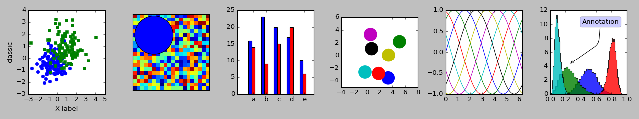
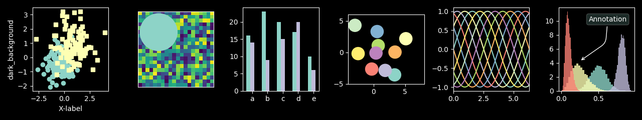
A series of styles are already prepared and included in the library, and all of them are available in Documentation - Matplotlib. From there, I took some to exemplify the range of possibilities we have at our disposal:
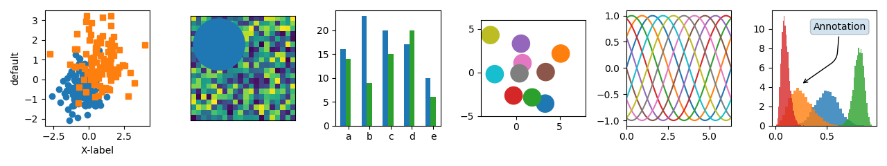
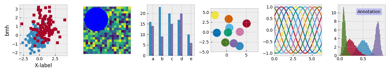
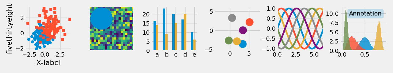
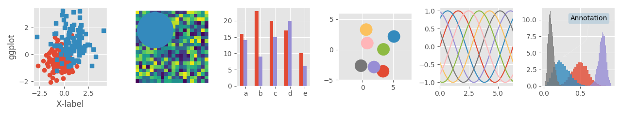
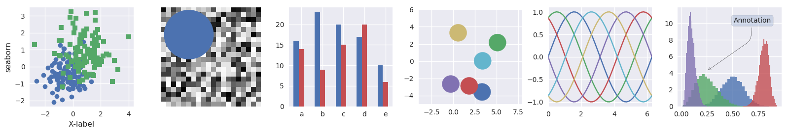
We indicate the use of a style by its name, and the following command:
plt.style.use('ggplot')
It’s also possible to combine various styles in a list, to produce unique results:
plt.style.use(['ggplot', 'dark_background'])
Note that styles further to the right will overwrite parameters previously defined by styles to the left, so the order in which they are provided can change the final result.
You can still customize each aspect of the plots individually, for more details, I suggest consulting the Documentation - Matplotlib. If you want to return to the original parameters, use:
plt.rcdefaults()
Dimensions
Another essential point: the relationship between figure size and font size. When we talk about publication quality, the texts and numbers in plots should be exactly the same size as the rest of the document where they are inserted.
The ideal here is the precise definition of the width and height you want for the figure, so that it can be inserted in the final document at a 1:1 scale, without any distortion.
There’s a Python package of my authorship that facilitates this task, figure-scale. More details can be found in its Documentation, but here we’ll see a usage example.
First, we need to install the package:
pip install figure-scale
The FigureScale class is the main component of the package.
It allows you to define figure dimensions in whatever way is most convenient for your case:
- Width and Height: Specify both dimensions explicitly;
- Width and Aspect Ratio: Specify the width and let the height be calculated from the aspect ratio;
- Height and Aspect Ratio: Specify the height and let the width be calculated from the aspect ratio.
All dimensions can be specified in various units. Let’s explore each approach:
import figure_scale as fs
size_a = fs.FigureScale(units="mm", width=100, height=100)
size_b = fs.FigureScale(units="mm", width=100, aspect=1.0)
size_c = fs.FigureScale(units="mm", height=100, aspect=1.0)
Let’s detail each parameter:
widthis the usable page width, that is, the page width minus both margins. Or the column width, for cases where this applies. In $\LaTeX$ documents, this value can be obtained with the command\the\columnwidth;heightcan be used for absolute height adjustment, if fine-tuning is desired. In $\LaTeX$ documents, this value can be obtained with the command\the\textheight;aspectdefines the figure height as a relative value in relation to width. For example,aspect=1.0will create a square figure, whileaspect=9.0/16.0will create the right proportion for wide-screen displays;unitsrepresents the length unit forwidthandheight, some of the supported options are “in” (inch), “mm”, “cm” and “pt” (typographic points, used in $\LaTeX$). Thus, the object performs the proper unit conversion, since Matplotlib expects this definition in inches.
Note that only two of the three parameters width, height and aspect are necessary, the third will be calculated automatically from the other two.
The FigureScale class implements the Sequence protocol, making it acceptable as an argument for the figsize parameter in any Matplotlib function that accepts it, such as plt.subplots(), plt.figure() and others.
See how we can now precisely define the standard we want for dimensions and font size:
plt.rcParams.update(
    {
        #
        'figure.figsize' : fs.FigureScale(units='mm', width=160, aspect=1),
        #
        "axes.labelsize": 12,
        "axes.titlesize" : 12,
        "font.size": 12,
        "legend.fontsize": 12,
        "xtick.labelsize": 12,
        "ytick.labelsize": 12,
    }
)
It’s possible to later make a custom adjustment for each figure, for example:
fig, axes = plt.subplots(figsize=fs.FigureScale(units='mm', width=160, aspect=1))
All my technical/scientific production has been done in $\LaTeX$, which I certainly recommend. In fact, this could be a topic for another post in the near future. If this isn’t your case, it might be time to proceed to the next topic. Either way, I’ll share some other adjustments for reference:
Article with Elsevier’s two-column template:
plt.rcParams.update(
    {
        'figure.figsize' : fs.FigureScale(units='pt', width=238.25444, aspect=3/4),
        #
        "axes.labelsize": 8,
        "axes.titlesize" : 8,
        "font.size": 8,
        "legend.fontsize": 8,
        "xtick.labelsize": 8,
        "ytick.labelsize": 8,
    }
)
Technical report, Dissertation or Thesis with abnTeX2:
plt.rcParams.update(
    {
        'figure.figsize' : fs.FigureScale(units='pt', width=455.0, aspect=3/4),
        #
        "axes.labelsize": 12,
        "axes.titlesize" : 12,
        "font.size": 12,
        "legend.fontsize": 12,
        "xtick.labelsize": 12,
        "ytick.labelsize": 12,
    }
)
A0 size poster with beamer (and this template):
plt.rcParams.update(
    {
        'figure.figsize' : fs.FigureScale(units='pt', width=2376.3973*.75, aspect=9/16),
        #
        "axes.labelsize": 24,
        "axes.titlesize" : 24,
        "font.size": 24,
        "legend.fontsize": 24,
        "xtick.labelsize": 24,
        "ytick.labelsize": 24,
    }
)
Slide presentation with beamer (and the Focus v2.6 theme):
plt.rcParams.update(
    {
        'figure.figsize' : fs.FigureScale(units='pt', width=412.56497, aspect=9/16),
    }
)
In $\LaTeX$, you can be sure everything worked out when the figure is included with scale=1, and the dimensions and font size look appropriate, for example:
\includegraphics[scale=1]{<figure_name>}
Format
Finally, we have the format in which the plots will be saved. They can be basically divided into two large groups, and we have a code block to exemplify:
import numpy as np

x = np.linspace(0.0, 2.0 * np.pi)
y = np.sin(x)

for f in ['jpg', 'svg']:

    plt.plot(x,y, label = 'Label')
    plt.legend()
    plt.savefig('example_line.'+f, format=f)
Raster format: The figure consists of an array of pixels (or matrix), which has a defined size, for example 240 x 120 pixels. If we want to enlarge it, we’ll see each small pixel, in a somewhat squared effect. In this group we have, for example, JPG and PNG formats, see the result:
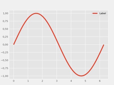
Raster format figure 768 x 576 pixels (jpg). The figure quality is controlled by the number of pixels, or the dpi parameter (dots per inch). Increasing dpi increases image quality, but also increases its disk space;
Vector Format: Here, the figure is composed of vectors, using mathematical elements to compose the complete figure. Unlike the previous group, it doesn’t lose quality when enlarged. As examples we have SVG and PDF formats, see the figure:

Vector format figure (svg).
But after all, which one to choose? The answer is: it depends.
I’d say vector options are preferable (svg for web, PDF for technical production) because they maintain good visual presentation even on high-resolution screens or prints, or when figures are enlarged. However, there are applications that simply don’t accept vector formats (like some social networks), so we can switch to raster format (jpg or png). Another challenge for vector format is when we have a high number of vector artifacts. Regardless of the type of plot, as the amount of data increases from hundreds, to thousands and millions of points, it might be that the space the vector figure occupies on disk is, after all, impractical.
Note however that there’s an intermediate approach, methods in Matplotlib that allow converting vector elements to raster representation, called rasterization.
To exemplify this, we have a modified code block from Documentation - Matplotlib, see the code and resulting figure:
import numpy as np
import matplotlib.pyplot as plt

d = np.arange(100).reshape(10, 10)
x, y = np.meshgrid(np.arange(11), np.arange(11))

theta = 0.25*np.pi
xx = x*np.cos(theta) - y*np.sin(theta)
yy = x*np.sin(theta) + y*np.cos(theta)

fig, (ax1, ax2, ax3) = plt.subplots(1, 3)

ax1.set_aspect(1)
ax1.pcolormesh(xx, yy, d)
ax1.text(0.5, 0.5, "Text", alpha=0.2,
         va="center", ha="center", size=50, transform=ax1.transAxes)
ax1.set_title("No Rasterization")

ax2.set_aspect(1)
ax2.pcolormesh(xx, yy, d, zorder=-15)
ax2.text(0.5, 0.5, "Text", alpha=0.2, zorder=5,
         va="center", ha="center", size=50, transform=ax2.transAxes)
ax2.set_title("Rasterization z$<-10$")
ax2.set_rasterization_zorder(-10)

ax3.set_aspect(1)
ax3.pcolormesh(xx, yy, d)
ax3.text(0.5, 0.5, "Text", alpha=0.2,
         va="center", ha="center", size=50, transform=ax3.transAxes)
ax3.set_title("Rasterization")
ax3.set_rasterized(True)

plt.savefig("test_rasterization.pdf", dpi=150)
plt.savefig("test_rasterization.eps", dpi=150)

if not plt.rcParams["text.usetex"]:
    plt.savefig("test_rasterization.svg")

We see above a vector figure with three sub-plots:
- In the left element, we have the purely vector figure (No Rasterization), notice the good visual quality even when enlarged;
- The figure on the right was converted to raster format (Rasterization) with the line
ax3.set_rasterized(True), including title, coordinates, annotation and thepcolormesh, even though the figure was saved as svg. Notice how it was totally represented pixel by pixel; - In the center we have an intermediate solution. In this case, only elements with
zorder1 less than-10were transformed with the lineax2.set_rasterization_zorder(-10), in this case we have thepcolormesh. Title, coordinates and annotation remained vectorial, and thus, we can get the best of both worlds.
The effective choice about which elements to convert is again a compromise between image quality and its disk size, and this certainly depends on each application, or even personal preference. Note that dpi is still a valid parameter for elements converted to pixels.
Finally, we can define these parameters to be applied as default in our code as follows:
plt.rcParams.update(
    {
        'figure.dpi' : 240,
        'savefig.format' : 'pdf',
        #
        'text.usetex' : True,
        'text.latex.preamble' : "\\usepackage{icomma}",
    }
)
The text.usetex option is particularly useful for those who use $\LaTeX$, allowing you to include equations as annotations, title or as label for coordinates. The option 'text.latex.preamble' : "\\usepackage{icomma}" is a bonus, this eliminates the space inserted in math mode after each comma, which are certainly not welcome when we talk about publication quality.
Conclusion
The presentation of high-quality results is a fundamental point to attract engagement and attention from your audience. Here it was demonstrated how attention to details and a few lines of code can have a huge impact on the presentation of results in graphical format. Finally, I hope that this account of mine about producing figures in Python and Matplotlib will be useful to you as a starting point and motivation to continue studying the topic.
The
zorderparameter controls the order in which each plot element will be displayed, that is, text withzorder=5will be displayed over thepcolormeshfigure withzorder=-15. For more information, consult the Documentation - Matplotlib. ↩︎
Felipe N. Schuch
Application Engineer
I have the experience of applying and also developing computational tools that are able to solve complex problems, besides processing, visualizing, and communicating the data produced by these solutions. They are often powered by High-Performance Computing (HPC).